

❮
❯
The center point of my logo is a Mandala. The Mandala represents wholeness, balance, and perfection. All things that I value not only in life but also in my work.
My logo was first drawn on paper and then transported digitally. This allowed me to keep a hand drawn look while still accomplishing a high resolution defined image that could be manipulated for different uses with ease.
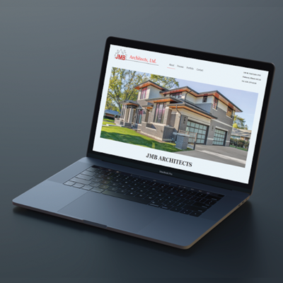
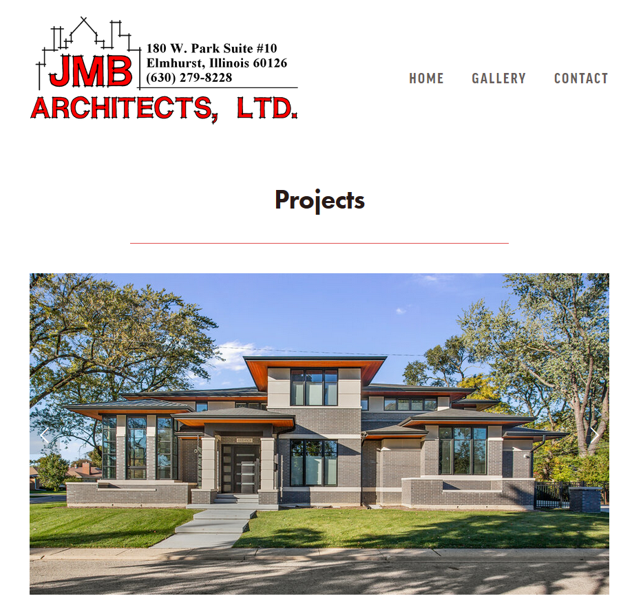
In 2019, JMB Architects decided to remake their entire website as their Network Solutions platform just wasn't helping the business. I was the individual put in charge of making this new website. In doing so I learned to work with a client in creating a design specifically related to what they had envisioned using Squarespace along with custom CSS and HTML. A major benefit to using Squarspace along with custom code is that the client can easily make adjustments to verbiage and images on their own. This not only makes it easier for the Web Developer, but the client has more control over the project and doesn't need to contact someone to make small updates or changes every time. The process of creating this website consisted of making wireframes, hi-fidelity mockups using Figma, and some user testing with clients of JMB Architects. The final product of this project is online and can be seen using the link below. Within the first two weeks of launching, JMB Architects received several customer contacts and at least one new client, proving the value of a good website.


Land Grant Goods is a student-run company that creates and distributes honey, jam and tea. I had the opportunity to work in a team of 4 other user experience designers to create a content stratagy guide for them. Our goal was to create a document for Land Grant Goods to look at when promoting products or talking with their followers online. We wanted to create a unified document that all team members of Land Grant Goods could access and easily understand now and in the future.
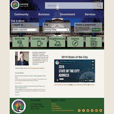

In 2018 I created a redesign of the Lansing, Michigan city's website. Nearly everyone in the Lansing area has used the city site, whether it is to pay a parking ticket, apply for a permit, or find a job. Almost all can agree that it takes a long time to figure out how to do any of this on the unorganized website. When looking to redesign the Lansing website I created a landscape analysis of 4 other cities' websites, created user scenarios and user flows, created a style guide, wire frames, and a final visual comp. A lot of research was put into what makes a good and bad city website in order to try and make the best redesign possible.
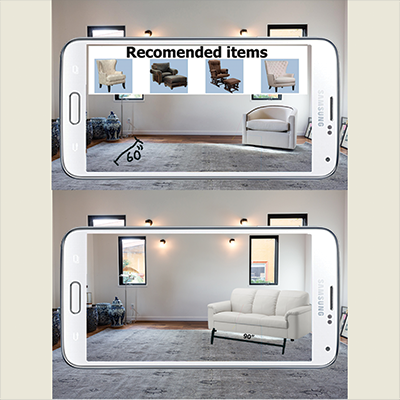

By combining the technology of the iphone Measure app and augmented reality it will be possible to place objects and furniture into your home in actual size. This would allow companies to advertise their products and users could see the item in their home before committing to a purchase. This could be greatly taken advantage of by furniture companies and Amazon. If a user could see an item in their home in actual size, they may be more inclined to buy the item, making items that users normally would be less likely to purchase online more accessible.
This project was created before Amazon came out with the "View in Your Room" feature. The original project can be seen with the link below.
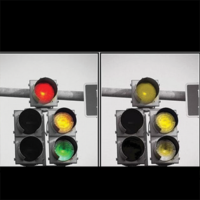

Colorblindness is a condition that affects approximately 4.5% of the population. As you can imagine, if a driver cannot tell the difference between the colors of the traffic lights, it can create damage to persons and property. Most ideas for a solution are either too much work or too costly to actually implement. My solution is a heat and weather resistant vinyl sticker that can be applied in minutes from the ground with an extending pole, thereby using minimal resources. I was able to do extensive research on all aspects including the math that went into the heat of the light, sizing, and even angles that would be used to apply the sticker. I also made a scaled down prototype to show how the sticker application would work. I chose a diamond shape on the yellow light because standard road signs that are yellow and/or diamond shape indicate a warning. The result is a help for color blind individuals that does not negatively affect others.
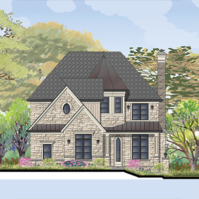

One of my responsibilities at JMB Architects is to create two dimensional renderings of a new home's facade, based on the architectural plans. These renderings help the client to see their house before it is built and pick out paint colors, brick types, and etc. This is a critical step for many of JMB Architects clients as it can be hard for them to envision what a house would look like from a blueprint. During the design process of these renderings, many meetings take place between creator and client. It is important for me to have good communication skills, as it is not uncommon to go through several designs until the client is happy with the outcome. While the renderings are not specifically related to user experience, I enjoy the creative outlet.
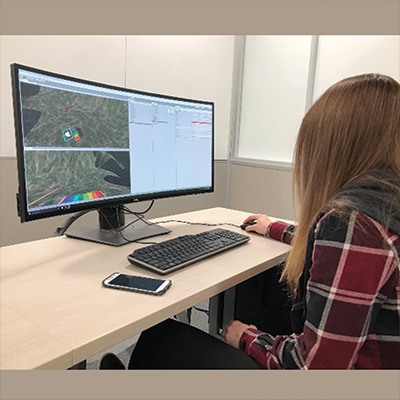
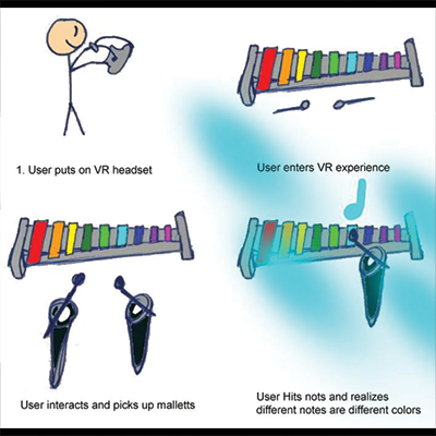
Synesthesia is a neurological condition in which sense pathways are connected. This can cause individuals to connect a color with letters, numbers, and/or sounds. Only 3-5% of the population has a form of synesthesia, therefore a group of individuals and I wanted to create a simulation for the rest of the population to be able to better understand this condition. Our VR experience mimics synesthesia by producing the audio-visual effect of seeing colors when musical notes are played. We did this by creating a small area in the VR environment with a xylophone that players can hit to produce notes. When notes are played, colored lights will flash at the player depending on what note is played. To create this simulation we used Unity and a public Oculas Rift that was made availible to us in order to test our project along the way.
